-35% SUR TOUS NOS TABLEAUXLIVRAISON OFFERTE DÈS 59€FABRIQUÉ EN EUROPE-35% SUR TOUS NOS TABLEAUXLIVRAISON OFFERTE DÈS 59€FABRIQUÉ EN EUROPE-35% SUR TOUS NOS TABLEAUXLIVRAISON OFFERTE DÈS 59€FABRIQUÉ EN EUROPE-35% SUR TOUS NOS TABLEAUXLIVRAISON OFFERTE DÈS 59€FABRIQUÉ EN EUROPE-35% SUR TOUS NOS TABLEAUXLIVRAISON OFFERTE DÈS 59€FABRIQUÉ EN EUROPE-35% SUR TOUS NOS TABLEAUXLIVRAISON OFFERTE DÈS 59€FABRIQUÉ EN EUROPE
35% OFF ALL OUR PAINTINGSFREE DELIVERY OVER £59MADE IN EUROPE35% OFF ALL OUR PAINTINGSFREE DELIVERY OVER £59MADE IN EUROPE35% OFF ALL OUR PAINTINGSFREE DELIVERY OVER £59MADE IN EUROPE35% OFF ALL OUR PAINTINGSFREE DELIVERY OVER £59MADE IN EUROPE35% OFF ALL OUR PAINTINGSFREE DELIVERY OVER £59MADE IN EUROPE35% OFF ALL OUR PAINTINGSFREE DELIVERY OVER £59MADE IN EUROPE
35% DE DESCUENTO EN TODOS NUESTROS CUADROSENVÍO GRATIS A PARTIR DE 59€FABRICADO EN EUROPA35% DE DESCUENTO EN TODOS NUESTROS CUADROSENVÍO GRATIS A PARTIR DE 59€FABRICADO EN EUROPA35% DE DESCUENTO EN TODOS NUESTROS CUADROSENVÍO GRATIS A PARTIR DE 59€FABRICADO EN EUROPA35% DE DESCUENTO EN TODOS NUESTROS CUADROSENVÍO GRATIS A PARTIR DE 59€FABRICADO EN EUROPA35% DE DESCUENTO EN TODOS NUESTROS CUADROSENVÍO GRATIS A PARTIR DE 59€FABRICADO EN EUROPA35% DE DESCUENTO EN TODOS NUESTROS CUADROSENVÍO GRATIS A PARTIR DE 59€FABRICADO EN EUROPA
35% DI SCONTO SU TUTTI I NOSTRI QUADRISPEDIZIONE GRATUITA SOPRA I 59€PRODOTTO IN EUROPA35% DI SCONTO SU TUTTI I NOSTRI QUADRISPEDIZIONE GRATUITA SOPRA I 59€PRODOTTO IN EUROPA35% DI SCONTO SU TUTTI I NOSTRI QUADRISPEDIZIONE GRATUITA SOPRA I 59€PRODOTTO IN EUROPA35% DI SCONTO SU TUTTI I NOSTRI QUADRISPEDIZIONE GRATUITA SOPRA I 59€PRODOTTO IN EUROPA35% DI SCONTO SU TUTTI I NOSTRI QUADRISPEDIZIONE GRATUITA SOPRA I 59€PRODOTTO IN EUROPA35% DI SCONTO SU TUTTI I NOSTRI QUADRISPEDIZIONE GRATUITA SOPRA I 59€PRODOTTO IN EUROPA
35% RABATT AUF ALLE UNSERE BILDERKOSTENLOSER VERSAND AB 59€HERGESTELLT IN EUROPA35% RABATT AUF ALLE UNSERE BILDERKOSTENLOSER VERSAND AB 59€HERGESTELLT IN EUROPA35% RABATT AUF ALLE UNSERE BILDERKOSTENLOSER VERSAND AB 59€HERGESTELLT IN EUROPA35% RABATT AUF ALLE UNSERE BILDERKOSTENLOSER VERSAND AB 59€HERGESTELLT IN EUROPA35% RABATT AUF ALLE UNSERE BILDERKOSTENLOSER VERSAND AB 59€HERGESTELLT IN EUROPA35% RABATT AUF ALLE UNSERE BILDERKOSTENLOSER VERSAND AB 59€HERGESTELLT IN EUROPA
35% KORTING OP AL ONZE SCHILDERIJENGRATIS VERZENDING VANAF 59€GEMAAKT IN EUROPA35% KORTING OP AL ONZE SCHILDERIJENGRATIS VERZENDING VANAF 59€GEMAAKT IN EUROPA35% KORTING OP AL ONZE SCHILDERIJENGRATIS VERZENDING VANAF 59€GEMAAKT IN EUROPA35% KORTING OP AL ONZE SCHILDERIJENGRATIS VERZENDING VANAF 59€GEMAAKT IN EUROPA35% KORTING OP AL ONZE SCHILDERIJENGRATIS VERZENDING VANAF 59€GEMAAKT IN EUROPA35% KORTING OP AL ONZE SCHILDERIJENGRATIS VERZENDING VANAF 59€GEMAAKT IN EUROPA
-35% SUR TOUS NOS TABLEAUXLIVRAISON OFFERTE DÈS 59€FABRIQUÉ EN EUROPE-35% SUR TOUS NOS TABLEAUXLIVRAISON OFFERTE DÈS 59€FABRIQUÉ EN EUROPE-35% SUR TOUS NOS TABLEAUXLIVRAISON OFFERTE DÈS 59€FABRIQUÉ EN EUROPE-35% SUR TOUS NOS TABLEAUXLIVRAISON OFFERTE DÈS 59€FABRIQUÉ EN EUROPE-35% SUR TOUS NOS TABLEAUXLIVRAISON OFFERTE DÈS 59€FABRIQUÉ EN EUROPE-35% SUR TOUS NOS TABLEAUXLIVRAISON OFFERTE DÈS 59€FABRIQUÉ EN EUROPE
35% OFF ALL OUR PAINTINGSFREE DELIVERY OVER £59MADE IN EUROPE35% OFF ALL OUR PAINTINGSFREE DELIVERY OVER £59MADE IN EUROPE35% OFF ALL OUR PAINTINGSFREE DELIVERY OVER £59MADE IN EUROPE35% OFF ALL OUR PAINTINGSFREE DELIVERY OVER £59MADE IN EUROPE35% OFF ALL OUR PAINTINGSFREE DELIVERY OVER £59MADE IN EUROPE35% OFF ALL OUR PAINTINGSFREE DELIVERY OVER £59MADE IN EUROPE
35% DE DESCUENTO EN TODOS NUESTROS CUADROSENVÍO GRATIS A PARTIR DE 59€FABRICADO EN EUROPA35% DE DESCUENTO EN TODOS NUESTROS CUADROSENVÍO GRATIS A PARTIR DE 59€FABRICADO EN EUROPA35% DE DESCUENTO EN TODOS NUESTROS CUADROSENVÍO GRATIS A PARTIR DE 59€FABRICADO EN EUROPA35% DE DESCUENTO EN TODOS NUESTROS CUADROSENVÍO GRATIS A PARTIR DE 59€FABRICADO EN EUROPA35% DE DESCUENTO EN TODOS NUESTROS CUADROSENVÍO GRATIS A PARTIR DE 59€FABRICADO EN EUROPA35% DE DESCUENTO EN TODOS NUESTROS CUADROSENVÍO GRATIS A PARTIR DE 59€FABRICADO EN EUROPA
35% DI SCONTO SU TUTTI I NOSTRI QUADRISPEDIZIONE GRATUITA SOPRA I 59€PRODOTTO IN EUROPA35% DI SCONTO SU TUTTI I NOSTRI QUADRISPEDIZIONE GRATUITA SOPRA I 59€PRODOTTO IN EUROPA35% DI SCONTO SU TUTTI I NOSTRI QUADRISPEDIZIONE GRATUITA SOPRA I 59€PRODOTTO IN EUROPA35% DI SCONTO SU TUTTI I NOSTRI QUADRISPEDIZIONE GRATUITA SOPRA I 59€PRODOTTO IN EUROPA35% DI SCONTO SU TUTTI I NOSTRI QUADRISPEDIZIONE GRATUITA SOPRA I 59€PRODOTTO IN EUROPA35% DI SCONTO SU TUTTI I NOSTRI QUADRISPEDIZIONE GRATUITA SOPRA I 59€PRODOTTO IN EUROPA
35% RABATT AUF ALLE UNSERE BILDERKOSTENLOSER VERSAND AB 59€HERGESTELLT IN EUROPA35% RABATT AUF ALLE UNSERE BILDERKOSTENLOSER VERSAND AB 59€HERGESTELLT IN EUROPA35% RABATT AUF ALLE UNSERE BILDERKOSTENLOSER VERSAND AB 59€HERGESTELLT IN EUROPA35% RABATT AUF ALLE UNSERE BILDERKOSTENLOSER VERSAND AB 59€HERGESTELLT IN EUROPA35% RABATT AUF ALLE UNSERE BILDERKOSTENLOSER VERSAND AB 59€HERGESTELLT IN EUROPA35% RABATT AUF ALLE UNSERE BILDERKOSTENLOSER VERSAND AB 59€HERGESTELLT IN EUROPA
35% KORTING OP AL ONZE SCHILDERIJENGRATIS VERZENDING VANAF 59€GEMAAKT IN EUROPA35% KORTING OP AL ONZE SCHILDERIJENGRATIS VERZENDING VANAF 59€GEMAAKT IN EUROPA35% KORTING OP AL ONZE SCHILDERIJENGRATIS VERZENDING VANAF 59€GEMAAKT IN EUROPA35% KORTING OP AL ONZE SCHILDERIJENGRATIS VERZENDING VANAF 59€GEMAAKT IN EUROPA35% KORTING OP AL ONZE SCHILDERIJENGRATIS VERZENDING VANAF 59€GEMAAKT IN EUROPA35% KORTING OP AL ONZE SCHILDERIJENGRATIS VERZENDING VANAF 59€GEMAAKT IN EUROPA
Reduce Stress at Home with These Calming Wall Art Styles
3 October 2026 Laure D 8 min de lecture
Your walls shape how you feel the moment you walk through the door. Visual clutter, harsh contrasts, and chaotic patterns keep the nervous system alert. Calming wall art does the opposite: it uses color, subject, and composition to signal safety and rest. This guide breaks down the styles, palettes, and practical choices that turn a room into a recovery space.
Calming wall art uses soft colors, nature themes, and minimalist compositions to lower visual noise and reduce stress. Choosing the right size, placement, and finish enhances the effect.
Why Calming Wall Art Reduces Stress
Visual input travels directly to the amygdala, the brain’s threat detector. Busy patterns, high-contrast edges, and saturated reds or oranges trigger a low-level alert state. Soft edges, muted hues, and repetitive natural forms like trees or waves activate the parasympathetic branch instead. Studies in environmental psychology show that views of nature, even painted ones, lower cortisol and heart rate faster than urban scenes. A single large piece with a clear focal point reduces the cognitive load of scanning multiple small objects. The result is a measurable drop in perceived stress within minutes of entering the room.
The role of visual complexity
High complexity, many colors, overlapping shapes, busy textures, forces the brain to process more data. Low-complexity images with large color fields and simple horizons let the visual system rest. That is why a foggy shoreline works better than a detailed cityscape.
Color temperature and arousal
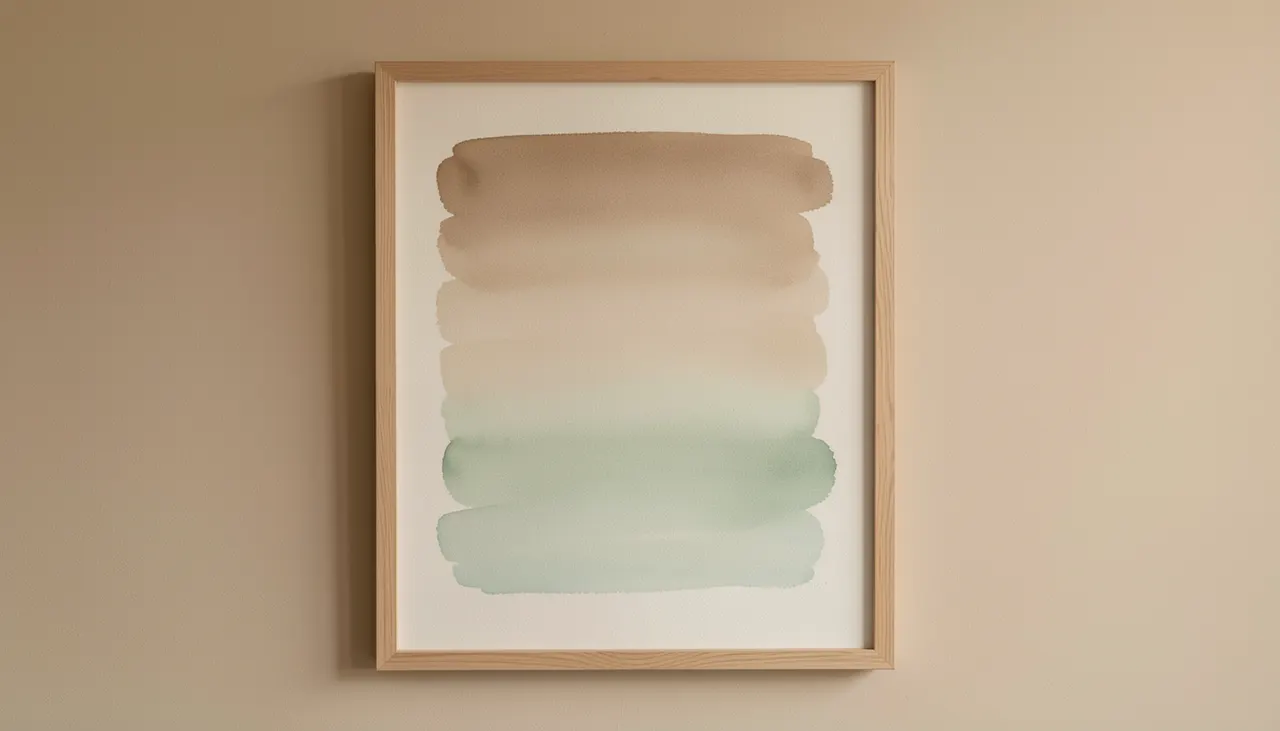
Cool colors (blue, green, violet) correlate with lower skin conductance and slower breathing. Warm neutrals (sand, clay, warm gray) add comfort without stimulation. Avoid pure white expanses; they can feel clinical. A hint of pigment warms the light and softens shadows.
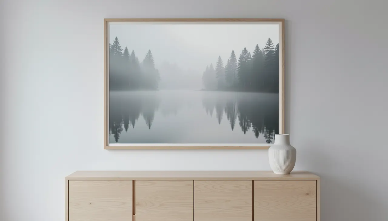
Tableau flou de paysage brumeux aux teintes douces
Best Color Palettes for a Relaxing Atmosphere
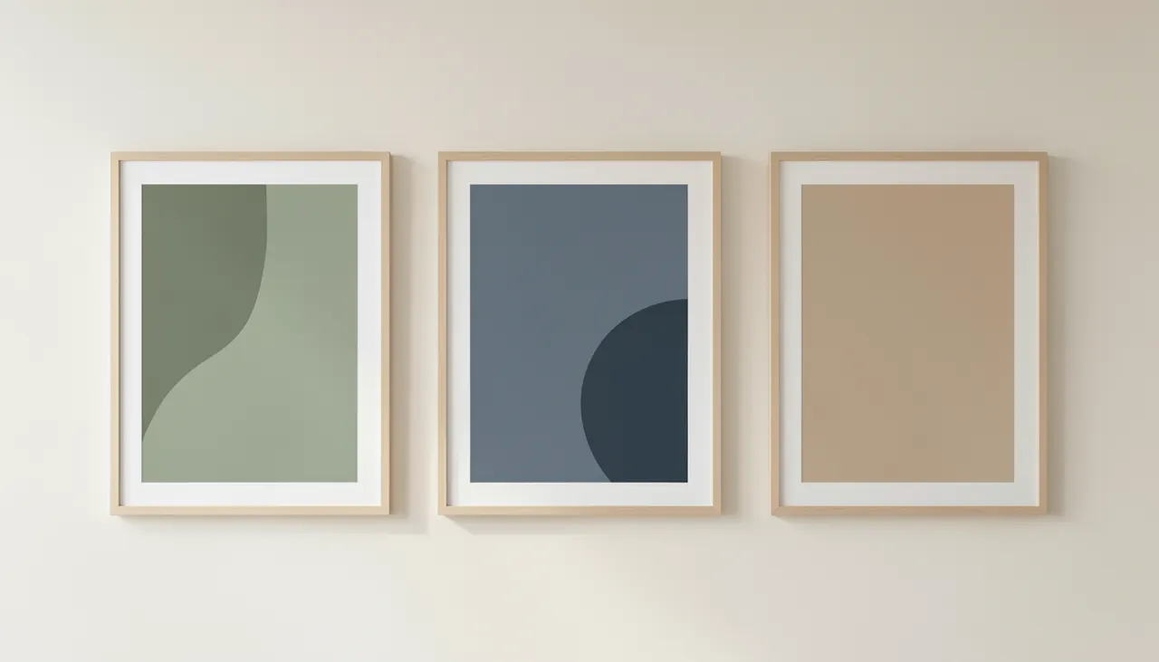
Color sets the emotional baseline before you recognize the subject. The most reliable calming palettes share three traits: low saturation, medium value, and analogous harmony. Below are the four combinations that consistently perform in bedrooms, living rooms, and home offices.
Triptyque de toiles aux teintes sauge et ardoise
Nature-Inspired Themes That Lower Cortisol
Biophilic design research confirms that representations of water, foliage, and open sky trigger restorative responses. The key is suggestion over detail. A misty forest where trunks dissolve into fog works better than a sharp botanical illustration. Water scenes, lakes, slow rivers, foggy coastlines, add a rhythmic visual cue that mimics breath. Horizon lines placed low in the frame create a sense of spaciousness; high horizons feel grounding. Choose images with depth layers: foreground texture, midground trees, background atmosphere. That layering invites the eye to travel slowly, which slows mental chatter.
Water and reflection
Still water doubles the visual field vertically, creating symmetry that the brain reads as order. Mirror-like surfaces in muted tones, dawn on a lake, a quiet canal, are especially effective in narrow hallways or small bedrooms where actual space is limited.
Forest and canopy views
Vertical tree trunks create a natural rhythm. Look for compositions where light filters through leaves in dappled patterns. That interplay of light and shadow mimics the experience of sitting under a canopy, which studies link to reduced rumination.
Minimalist art removes narrative. Without a story to decode, the mind stops projecting. Large color fields, single gestural lines, or geometric divisions in neutral tones act as visual breathing room. Abstract pieces work best when they echo the room’s architecture: a horizontal band that mirrors a sofa back, a vertical stroke that aligns with a door frame. Texture matters more than pigment here. A canvas with subtle raised strokes catches changing light through the day, keeping the piece alive without demanding attention. Avoid high-gloss finishes; they create glare points that break the calm. Matte or satin surfaces absorb light evenly.
Negative space as a design tool
Leaving 40 to 60 percent of the canvas untouched lets the wall color participate. The artwork becomes a frame for emptiness. This works especially well on warm white or greige walls where the boundary between art and wall blurs.
Monochrome series
Two or three panels in the same palette but varying tone create a rhythm without repetition. Hang them with 5 to 8 cm gaps. The eye moves from one to the next in a slow loop, similar to a breathing exercise.
Choosing the Right Size and Placement
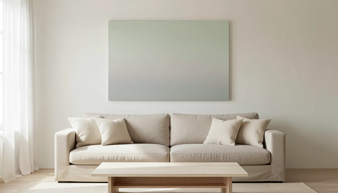
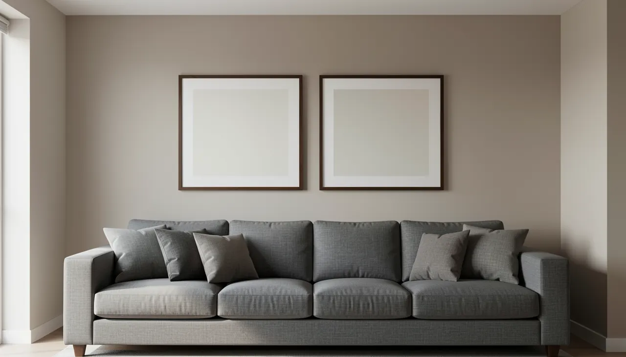
Scale determines whether the art anchors the room or gets lost. A common rule: the artwork width should cover 60 to 75 percent of the furniture width below it. For a 200 cm sofa, target 120 to 150 cm total art width, either one piece or a diptych. Center the midpoint at 150 to 160 cm from the floor (average eye level). In dining rooms, lower the center to 140 cm because viewers are seated. Leave 15 to 25 cm between the top of a headboard and the frame bottom. In hallways, use a single vertical piece at the far end to draw the eye forward without crowding the passage.
Grand diptyque proportionné au-dessus d’un canapé
Materials and Finishes That Enhance Serenity
The substrate and finish change how color behaves. Canvas on a wooden stretcher adds physical depth; the weave diffuses light and hides wall imperfections. A float frame (caisse américaine) creates a 1 to 2 cm shadow gap that lifts the image off the wall, adding quiet dimension. Aluminum composite panels with a matte laminate offer a perfectly flat, glare-free surface ideal for high-resolution nature photography. For bedrooms, avoid glass, it reflects lamps and window light at night. If you prefer a framed look, choose a deep-profile wood frame in a tone that matches your flooring or furniture, not the art. The frame should disappear into the room’s material language.
Canvas versus fine art paper
Canvas adds texture and warmth; paper behind acrylic gives maximum sharpness. For calming subjects, the slight softness of canvas usually feels more organic. If you choose paper, use a matte acrylic sheet, not standard glass, to cut reflections.
Float frame depth
A 2 cm deep float frame casts a consistent shadow line day and night. Thinner frames (1 cm) can look accidental. Deeper frames (3 cm+) start to read as objects rather than presentations. Match the frame wood species to the room’s dominant wood for cohesion.
Common Mistakes to Avoid When Hanging Calming Art
Even the right piece fails if the installation fights the intent. The errors below appear in real homes weekly. Fix them and the room settles immediately.
Frequently asked questions
What colors are most calming for wall art?
Low-saturation blues, sage greens, warm sand beiges, and muted blush pinks create the most restful atmosphere. They lower visual arousal without feeling cold or clinical.
How large should calming wall art be above a sofa?
Aim for 60 to 75 percent of the sofa width. For a standard 200 cm sofa, choose a single piece or a pair totaling 120 to 150 cm wide.
Should I use glass or acrylic over calming artwork?
Avoid standard glass; it creates glare that breaks the calm. If you need protection, use matte acrylic. Better yet, choose canvas or a matte-laminated panel that needs no glazing.
Can abstract art be calming?
Yes, when it uses low contrast, analogous colors, and ample negative space. Avoid busy geometric patterns or high-saturation color blocks.
What is the best height to hang art in a hallway?
Center the piece at 150 to 160 cm from the floor. In narrow halls, a single vertical work at the far end draws the eye forward without crowding the walkway.
Calming wall art is not a decoration afterthought. It is a environmental lever you pull once and benefit from daily. Pick a palette that matches your evening light, a subject that lets your eyes wander slowly, and a size that anchors the room. Hang it at the right height with a matte finish. The stress reduction starts the moment you stop noticing the art and start noticing the quiet.
Key takeaways
Soft blues, sage greens, warm sands, and muted blush pinks lower visual arousal and support relaxation.
Nature themes with mist, water, and layered depth trigger restorative responses more than detailed illustrations.
Artwork width should cover 60 to 75 percent of the furniture below it; center at 150 to 160 cm from the floor.
Matte canvas or matte-laminated panels prevent glare; float frames add subtle depth without visual weight.
Hanging too high, choosing undersized pieces, and using reflective glazing are the most common mistakes that undo the calming effect.
Partager sur :
Laure D
Passionate about interior design and architecture, Laure D. is the inspiring voice behind Museno. As a decor trends specialist, she elegantly decodes color harmonies, the art of detail, and space planning to transform every interior into a unique sanctuary. Through her articles and guides, Laure shares expert advice and inspiration to help you elevate your daily life, from contemporary minimalism to bolder aesthetics. Her mission: to bring life to your rooms and walls with inspiring, accessible ideas.