-35% SUR TOUS NOS TABLEAUXLIVRAISON OFFERTE DÈS 59€FABRIQUÉ EN EUROPE-35% SUR TOUS NOS TABLEAUXLIVRAISON OFFERTE DÈS 59€FABRIQUÉ EN EUROPE-35% SUR TOUS NOS TABLEAUXLIVRAISON OFFERTE DÈS 59€FABRIQUÉ EN EUROPE-35% SUR TOUS NOS TABLEAUXLIVRAISON OFFERTE DÈS 59€FABRIQUÉ EN EUROPE-35% SUR TOUS NOS TABLEAUXLIVRAISON OFFERTE DÈS 59€FABRIQUÉ EN EUROPE-35% SUR TOUS NOS TABLEAUXLIVRAISON OFFERTE DÈS 59€FABRIQUÉ EN EUROPE
35% OFF ALL OUR PAINTINGSFREE DELIVERY OVER £59MADE IN EUROPE35% OFF ALL OUR PAINTINGSFREE DELIVERY OVER £59MADE IN EUROPE35% OFF ALL OUR PAINTINGSFREE DELIVERY OVER £59MADE IN EUROPE35% OFF ALL OUR PAINTINGSFREE DELIVERY OVER £59MADE IN EUROPE35% OFF ALL OUR PAINTINGSFREE DELIVERY OVER £59MADE IN EUROPE35% OFF ALL OUR PAINTINGSFREE DELIVERY OVER £59MADE IN EUROPE
35% DE DESCUENTO EN TODOS NUESTROS CUADROSENVÍO GRATIS A PARTIR DE 59€FABRICADO EN EUROPA35% DE DESCUENTO EN TODOS NUESTROS CUADROSENVÍO GRATIS A PARTIR DE 59€FABRICADO EN EUROPA35% DE DESCUENTO EN TODOS NUESTROS CUADROSENVÍO GRATIS A PARTIR DE 59€FABRICADO EN EUROPA35% DE DESCUENTO EN TODOS NUESTROS CUADROSENVÍO GRATIS A PARTIR DE 59€FABRICADO EN EUROPA35% DE DESCUENTO EN TODOS NUESTROS CUADROSENVÍO GRATIS A PARTIR DE 59€FABRICADO EN EUROPA35% DE DESCUENTO EN TODOS NUESTROS CUADROSENVÍO GRATIS A PARTIR DE 59€FABRICADO EN EUROPA
35% DI SCONTO SU TUTTI I NOSTRI QUADRISPEDIZIONE GRATUITA SOPRA I 59€PRODOTTO IN EUROPA35% DI SCONTO SU TUTTI I NOSTRI QUADRISPEDIZIONE GRATUITA SOPRA I 59€PRODOTTO IN EUROPA35% DI SCONTO SU TUTTI I NOSTRI QUADRISPEDIZIONE GRATUITA SOPRA I 59€PRODOTTO IN EUROPA35% DI SCONTO SU TUTTI I NOSTRI QUADRISPEDIZIONE GRATUITA SOPRA I 59€PRODOTTO IN EUROPA35% DI SCONTO SU TUTTI I NOSTRI QUADRISPEDIZIONE GRATUITA SOPRA I 59€PRODOTTO IN EUROPA35% DI SCONTO SU TUTTI I NOSTRI QUADRISPEDIZIONE GRATUITA SOPRA I 59€PRODOTTO IN EUROPA
35% RABATT AUF ALLE UNSERE BILDERKOSTENLOSER VERSAND AB 59€HERGESTELLT IN EUROPA35% RABATT AUF ALLE UNSERE BILDERKOSTENLOSER VERSAND AB 59€HERGESTELLT IN EUROPA35% RABATT AUF ALLE UNSERE BILDERKOSTENLOSER VERSAND AB 59€HERGESTELLT IN EUROPA35% RABATT AUF ALLE UNSERE BILDERKOSTENLOSER VERSAND AB 59€HERGESTELLT IN EUROPA35% RABATT AUF ALLE UNSERE BILDERKOSTENLOSER VERSAND AB 59€HERGESTELLT IN EUROPA35% RABATT AUF ALLE UNSERE BILDERKOSTENLOSER VERSAND AB 59€HERGESTELLT IN EUROPA
35% KORTING OP AL ONZE SCHILDERIJENGRATIS VERZENDING VANAF 59€GEMAAKT IN EUROPA35% KORTING OP AL ONZE SCHILDERIJENGRATIS VERZENDING VANAF 59€GEMAAKT IN EUROPA35% KORTING OP AL ONZE SCHILDERIJENGRATIS VERZENDING VANAF 59€GEMAAKT IN EUROPA35% KORTING OP AL ONZE SCHILDERIJENGRATIS VERZENDING VANAF 59€GEMAAKT IN EUROPA35% KORTING OP AL ONZE SCHILDERIJENGRATIS VERZENDING VANAF 59€GEMAAKT IN EUROPA35% KORTING OP AL ONZE SCHILDERIJENGRATIS VERZENDING VANAF 59€GEMAAKT IN EUROPA
-35% SUR TOUS NOS TABLEAUXLIVRAISON OFFERTE DÈS 59€FABRIQUÉ EN EUROPE-35% SUR TOUS NOS TABLEAUXLIVRAISON OFFERTE DÈS 59€FABRIQUÉ EN EUROPE-35% SUR TOUS NOS TABLEAUXLIVRAISON OFFERTE DÈS 59€FABRIQUÉ EN EUROPE-35% SUR TOUS NOS TABLEAUXLIVRAISON OFFERTE DÈS 59€FABRIQUÉ EN EUROPE-35% SUR TOUS NOS TABLEAUXLIVRAISON OFFERTE DÈS 59€FABRIQUÉ EN EUROPE-35% SUR TOUS NOS TABLEAUXLIVRAISON OFFERTE DÈS 59€FABRIQUÉ EN EUROPE
35% OFF ALL OUR PAINTINGSFREE DELIVERY OVER £59MADE IN EUROPE35% OFF ALL OUR PAINTINGSFREE DELIVERY OVER £59MADE IN EUROPE35% OFF ALL OUR PAINTINGSFREE DELIVERY OVER £59MADE IN EUROPE35% OFF ALL OUR PAINTINGSFREE DELIVERY OVER £59MADE IN EUROPE35% OFF ALL OUR PAINTINGSFREE DELIVERY OVER £59MADE IN EUROPE35% OFF ALL OUR PAINTINGSFREE DELIVERY OVER £59MADE IN EUROPE
35% DE DESCUENTO EN TODOS NUESTROS CUADROSENVÍO GRATIS A PARTIR DE 59€FABRICADO EN EUROPA35% DE DESCUENTO EN TODOS NUESTROS CUADROSENVÍO GRATIS A PARTIR DE 59€FABRICADO EN EUROPA35% DE DESCUENTO EN TODOS NUESTROS CUADROSENVÍO GRATIS A PARTIR DE 59€FABRICADO EN EUROPA35% DE DESCUENTO EN TODOS NUESTROS CUADROSENVÍO GRATIS A PARTIR DE 59€FABRICADO EN EUROPA35% DE DESCUENTO EN TODOS NUESTROS CUADROSENVÍO GRATIS A PARTIR DE 59€FABRICADO EN EUROPA35% DE DESCUENTO EN TODOS NUESTROS CUADROSENVÍO GRATIS A PARTIR DE 59€FABRICADO EN EUROPA
35% DI SCONTO SU TUTTI I NOSTRI QUADRISPEDIZIONE GRATUITA SOPRA I 59€PRODOTTO IN EUROPA35% DI SCONTO SU TUTTI I NOSTRI QUADRISPEDIZIONE GRATUITA SOPRA I 59€PRODOTTO IN EUROPA35% DI SCONTO SU TUTTI I NOSTRI QUADRISPEDIZIONE GRATUITA SOPRA I 59€PRODOTTO IN EUROPA35% DI SCONTO SU TUTTI I NOSTRI QUADRISPEDIZIONE GRATUITA SOPRA I 59€PRODOTTO IN EUROPA35% DI SCONTO SU TUTTI I NOSTRI QUADRISPEDIZIONE GRATUITA SOPRA I 59€PRODOTTO IN EUROPA35% DI SCONTO SU TUTTI I NOSTRI QUADRISPEDIZIONE GRATUITA SOPRA I 59€PRODOTTO IN EUROPA
35% RABATT AUF ALLE UNSERE BILDERKOSTENLOSER VERSAND AB 59€HERGESTELLT IN EUROPA35% RABATT AUF ALLE UNSERE BILDERKOSTENLOSER VERSAND AB 59€HERGESTELLT IN EUROPA35% RABATT AUF ALLE UNSERE BILDERKOSTENLOSER VERSAND AB 59€HERGESTELLT IN EUROPA35% RABATT AUF ALLE UNSERE BILDERKOSTENLOSER VERSAND AB 59€HERGESTELLT IN EUROPA35% RABATT AUF ALLE UNSERE BILDERKOSTENLOSER VERSAND AB 59€HERGESTELLT IN EUROPA35% RABATT AUF ALLE UNSERE BILDERKOSTENLOSER VERSAND AB 59€HERGESTELLT IN EUROPA
35% KORTING OP AL ONZE SCHILDERIJENGRATIS VERZENDING VANAF 59€GEMAAKT IN EUROPA35% KORTING OP AL ONZE SCHILDERIJENGRATIS VERZENDING VANAF 59€GEMAAKT IN EUROPA35% KORTING OP AL ONZE SCHILDERIJENGRATIS VERZENDING VANAF 59€GEMAAKT IN EUROPA35% KORTING OP AL ONZE SCHILDERIJENGRATIS VERZENDING VANAF 59€GEMAAKT IN EUROPA35% KORTING OP AL ONZE SCHILDERIJENGRATIS VERZENDING VANAF 59€GEMAAKT IN EUROPA35% KORTING OP AL ONZE SCHILDERIJENGRATIS VERZENDING VANAF 59€GEMAAKT IN EUROPA
5 Famous Masterpieces That Actually Look Great in a Modern Living Room
7 October 2026 Laure D 15 min de lecture
Classic paintings often feel stuck in museums or period homes, but several iconic works translate surprisingly well into contemporary spaces. The secret lies in color balance, composition, and scale. A reproduction of The Starry Night brings movement to a minimalist wall. The Kiss adds warmth without clutter. Girl with a Pearl Earring offers a focal point that feels intimate rather than formal. The Great Wave introduces graphic energy that reads almost like modern design. Composition VIII delivers geometric rhythm that echoes mid-century modern lines. This guide breaks down why each piece works, what size to order, and how to hang it for maximum impact.
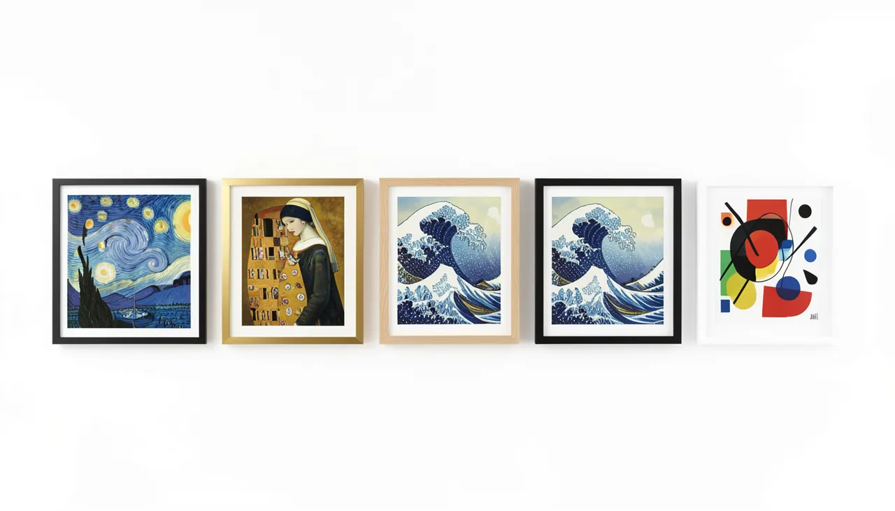
Five famous masterpieces that suit modern living rooms are Van Gogh’s Starry Night, Klimt’s The Kiss, Vermeer’s Girl with a Pearl Earring, Hokusai’s Great Wave, and Kandinsky’s Composition VIII. Each works with clean lines, neutral palettes, and contemporary furniture when sized and framed correctly.
Why Classic Art Works in Modern Spaces
Modern interiors rely on clean lines, restrained color palettes, and negative space. Famous paintings often share these qualities without trying. Vermeer used limited pigments. Hokusai flattened perspective into bold shapes. Kandinsky built compositions from pure geometry. When you strip away ornate frames and heavy mats, the artwork itself speaks a visual language that aligns with contemporary design. The key is reproduction quality. A cheap poster on thin paper undermines the effect. A canvas print on a wooden stretcher bar or an aluminum panel with a float frame preserves texture and depth. The finish matters too. Matte surfaces reduce glare from overhead lighting. Satin finishes enhance color saturation without mirror-like reflection. Choose based on your room’s light conditions.
Color harmony with neutral furniture
Most modern living rooms use gray, beige, white, or greige as a base. The five masterpieces below each contain dominant hues that either complement or intentionally contrast these neutrals. Starry Night brings cool blues and vibrant yellows that pop against warm gray walls. The Kiss contributes gold and amber tones that warm up cool white spaces. Girl with a Pearl Earring stays within a narrow range of ochre, white, and deep brown, blending seamlessly with earth-toned upholstery. The Great Wave limits itself to indigo, Prussian blue, and crisp white, creating a monochromatic statement. Composition VIII introduces primary red, yellow, and blue against a pale ground, acting as a built-in accent palette.
Scale and visual weight
A common mistake is choosing a print too small for the wall. A 40 by 60 centimeter reproduction disappears above a three-meter sofa. For a standard 2.5 meter wide seating area, aim for an artwork width between 100 and 150 centimeters. That means either one large piece or a diptych. Vertical formats work well on narrow walls between windows. Horizontal formats anchor wide expanses. The float frame adds three to five centimeters per side, so factor that into your measurements. Leave at least 15 centimeters of wall space on each side of the frame so the piece breathes.
Side by side comparison of five famous artworks in modern frames
The Starry Night by Vincent van Gogh
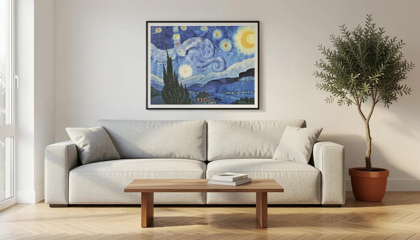
Painted in 1889, this night scene swirls with energy. The cypress tree anchors the left edge. The village sleeps below a turbulent sky. In a modern living room, the painting’s vertical movement draws the eye upward, making ceilings feel higher. The dominant blues cool down a room with warm wood floors or leather furniture. The yellow stars and moon inject a focal glow that reads like a designed accent color. Choose a canvas texture reproduction to capture the impasto brushwork. A thin black float frame creates a crisp border that feels intentional, not decorative. Avoid heavy gold frames; they fight the painting’s raw emotion.
Best placement and lighting
Hang the center of the artwork at 155 centimeters from the floor. That aligns with average eye level when seated. Position it centered above the sofa or offset toward a reading chair for an asymmetrical layout. Use a picture light with a 2700K bulb if the room lacks natural light. LED strips mounted behind the frame create a subtle halo that emphasizes the float effect. Avoid direct sunlight; UV exposure fades even archival inks over time. If the wall gets afternoon sun, choose a UV-protective acrylic glazing instead of standard glass.
Color palette reference
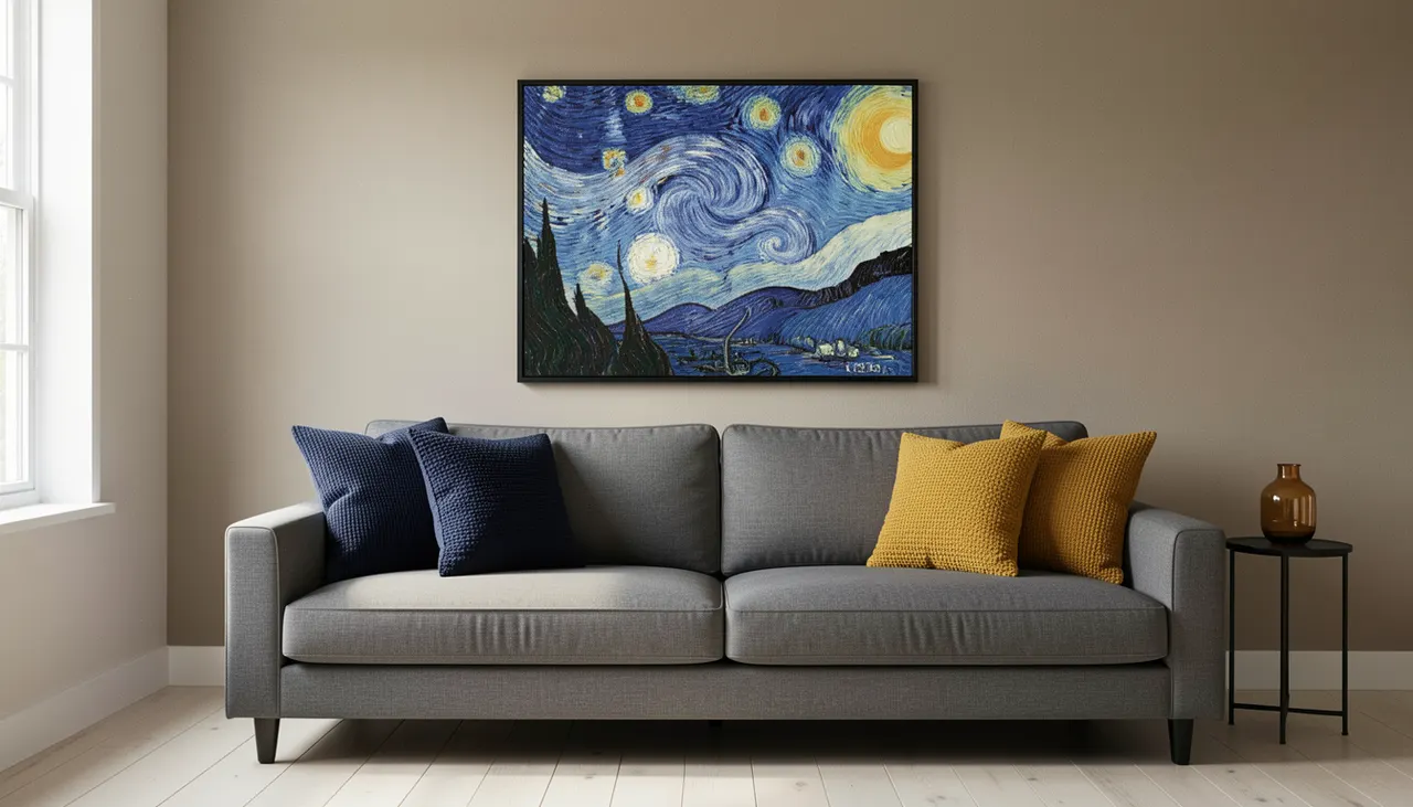
The painting’s core colors translate into a usable interior palette. Deep midnight blue for accent pillows or a throw. Bright lemon yellow for a single ceramic vase. Sage green from the cypress for a plant pot. Warm gray-beige from the village roofs for wall paint. These four tones create a cohesive scheme without matching the artwork exactly.
Starry Night reproduction in black float frame above gray sofa
The Kiss by Gustav Klimt
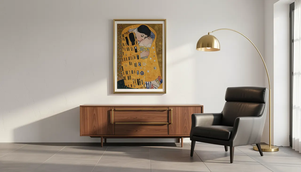
Completed in 1908, this gold-leaf masterpiece radiates warmth. The embracing figures dissolve into patterned robes against a shimmering gold ground. In a modern setting, the gold acts as a metallic accent that pairs with brass hardware, lighting fixtures, or mirror frames. The square format (originally 180 by 180 centimeters) fits perfectly above a low credenza or centered on a square wall section. The intricate patterns reward close viewing, so place it where people can approach, a hallway wall or reading nook works well. A warm gold float frame extends the artwork’s own tone. A black frame creates high contrast for a more graphic look.
Sizing for square formats
Square artworks need balanced wall space. For a 100 by 100 centimeter print, allow 40 centimeters of clear wall on all sides. That requires a wall section at least 180 centimeters wide. If your wall is narrower, scale down to 80 by 80 centimeters. The float frame adds roughly eight centimeters total to each dimension. Measure the outer frame edge, not the image area, when planning spacing. A pair of 60 by 60 centimeter prints spaced 10 centimeters apart can substitute for one large square if budget or wall size demands it.
Material choices for gold tones
Gold pigment reproductions vary wildly. Cheap prints turn brassy or greenish. Look for reproductions labeled giclée on archival canvas with pigment inks rated 100+ years. Aluminum composite panels (Dibond) with a matte laminate preserve gold luster without glare. Canvas on stretcher bars adds physical depth that mimics the original’s texture. Avoid glossy photo paper; it creates hot spots that break the gold field into distracting reflections. Request a proof sample if ordering a large format.
The Kiss in gold float frame on white wall near brass floor lamp
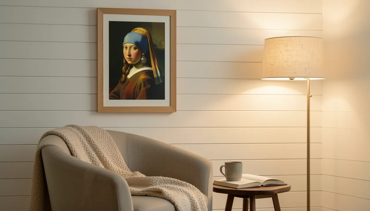
This 1665 portrait captivates through simplicity. A young woman turns over her shoulder, one pearl catching light against a dark background. The composition is tight, the palette restrained: ochre jacket, white collar, blue turban, deep brown background. In a modern living room, the painting reads like a photographic portrait, intimate, quiet, timeless. It suits smaller walls: beside a window, above a sideboard, or flanking a fireplace. The dark background means the frame choice controls the mood. A natural oak float frame grounds it in warmth. A matte black frame sharpens the contrast for a gallery feel. A white frame lifts the subject for a Scandinavian look.
Intimate scale for close viewing
The original measures 44.5 by 39 centimeters. Reproductions at 60 by 50 centimeters preserve the intimate scale without feeling diminutive. At this size, the viewer stands 60 to 90 centimeters away, close enough to see the pearl’s highlight and the brushwork on the lips. This makes it ideal for a reading corner or bedroom seating area. Avoid blowing it up to 120 centimeters wide; the close-cropped composition loses tension at large scale. If you need a larger statement, pair it with a second Vermeer or a minimalist abstract in matching tones.
Lighting the pearl
The pearl is the painting’s anchor. Position a directional spotlight or adjustable track head so the highlight on the pearl catches real light at the same angle as the painted highlight (upper left). A 15-degree beam angle at 3000K replicates the original’s warm glow. If using picture lights, mount two small LEDs on either side of the frame rather than one centered above; this creates dimensional modeling on the subject’s face. Test at night before finalizing position.
Girl with Pearl Earring in oak float frame on reading nook wall
The Great Wave off Kanagawa by Katsushika Hokusai
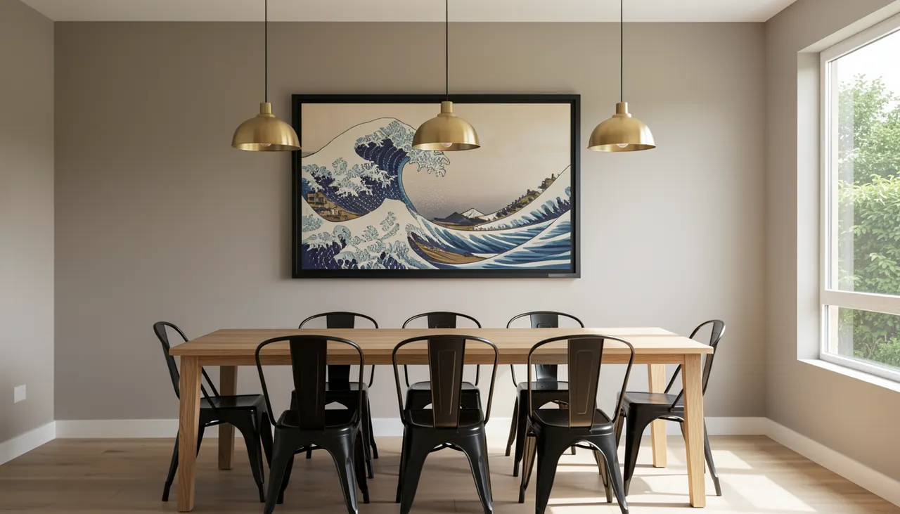
This 1831 woodblock print defines graphic power. A massive wave curls toward the viewer, Mount Fuji tiny in the trough. The palette is essentially three colors: indigo, Prussian blue, and the white of the paper. That restraint makes it a natural fit for modern interiors, it reads like a bold graphic poster rather than a traditional painting. The horizontal format (original roughly 25 by 37 centimeters) scales beautifully to wide formats. A 150 by 100 centimeter reproduction becomes a dramatic landscape anchor. The strong diagonal line of the wave leads the eye across the room, visually widening narrow spaces.
Horizontal impact on wide walls
For a wall three meters wide, a 150 centimeter wide print centered leaves 75 centimeters on each side, ideal breathing room. If the sofa is centered on that wall, align the print’s center with the sofa’s center. The wave’s crest should sit roughly at standing eye level (160 centimeters from floor). This places Mount Fuji at a comfortable viewing height. In a dining room, hang it slightly lower (145 centimeters center) so seated diners engage with the horizon line. The float frame in matte black disappears against the dark wave, letting the image float.
Paper versus canvas for woodblocks
Woodblock prints have flat color areas and sharp lines. Canvas texture can soften those edges undesirably. A smooth matte fine art paper (Hahnemühle Photo Rag or similar) mounted on aluminum composite panel preserves the crispness. If you prefer canvas, choose a fine-weave linen canvas with minimal texture and request a satin protective coating. The coating also protects against humidity shifts that cause paper to ripple. Float frames work best with rigid panels; canvas on stretcher bars may bow slightly at large sizes.
Great Wave large horizontal print in black float frame above dining table
Composition VIII by Wassily Kandinsky
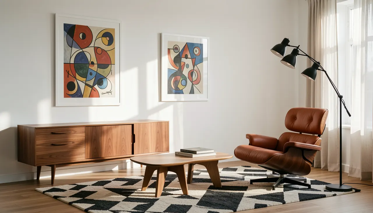
Painted in 1923, this geometric abstraction arranges circles, triangles, lines, and grids across a pale ground. Primary colors, red, yellow, blue, punctuate black and white forms. The composition feels architectural, almost like a blueprint. That structural quality resonates with modern furniture’s clean geometry. It works best in rooms with mid-century modern, Scandinavian, or industrial pieces. The white background keeps it light; the artwork doesn’t visually weigh down the wall. A white float frame continues the ground color, making the shapes appear to float in space. A black frame contains the energy for a more defined border.
Geometric dialogue with furniture
Match the artwork’s shapes to furniture silhouettes. A round coffee table echoes the circles. A triangular side table picks up the triangles. A grid-based shelving unit reflects the linear networks. This isn’t about matching colors, it’s about repeating visual logic. The artwork becomes a diagram of the room’s own language. Place it where multiple sightlines converge: the far wall of an open-plan living-dining area, or the wall facing the entry. At 100 by 100 centimeters, it holds its own from across the room.
Color extraction for accents
Pull the three primaries into small accents only. One red ceramic bowl. One yellow wool throw. One blue glass vase. Keep the rest of the room neutral: white walls, gray upholstery, light wood floors. The artwork then reads as the room’s color key. If you add too many primary-colored objects, the space feels like a kindergarten. Restraint lets the painting do the work. The black lines in the composition also justify black metal furniture legs or picture frames elsewhere in the room.
Composition VIII in white float frame mid-century modern living room
How to Choose the Right Size and Placement
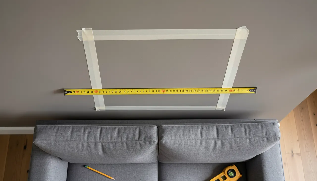
Size and placement determine whether a masterpiece reproduction elevates a room or gets lost. Start by measuring the wall width where the art will hang. Multiply that width by 0.6 to 0.75 for the ideal artwork width (including frame). A 300 centimeter wall wants a 180 to 225 centimeter wide piece. For a single artwork above a sofa, match the artwork width to 60 to 75 percent of the sofa width. A 240 centimeter sofa pairs with a 145 to 180 centimeter wide artwork. Height follows width based on the original aspect ratio. Use painter’s tape to outline the proposed dimensions on the wall before ordering. Live with the tape for a day. Check from every seating position.
Height formulas that work
The center-of-artwork-at-155-centimeters rule works for most seated viewing. For standing-view areas (hallways, entryways), raise the center to 165 centimeters. For very high ceilings (over 3 meters), you can go to 170 centimeters center. The bottom of the frame should clear the sofa back by 20 to 30 centimeters. Any lower and heads hit the frame. Any higher and the connection between art and furniture breaks. For a gallery wall grouping, treat the group as one unit: center the group’s midpoint at 155 centimeters.
Frame depth and shadow gaps
Float frames create a shadow gap between artwork and frame inner wall. Standard depths: 2 centimeters for small works (under 60 centimeters), 3 centimeters for medium (60 to 100 centimeters), 4 centimeters for large (over 100 centimeters). The gap itself is typically 1 to 1.5 centimeters. Deeper frames cast stronger shadows, adding sculptural presence. Shallower frames read flatter, more minimal. Choose depth based on room style: deeper for traditional or maximalist, shallower for minimalist or Scandinavian. The frame face width (the visible front edge) should stay thin, 0.5 to 1 centimeter, regardless of depth.
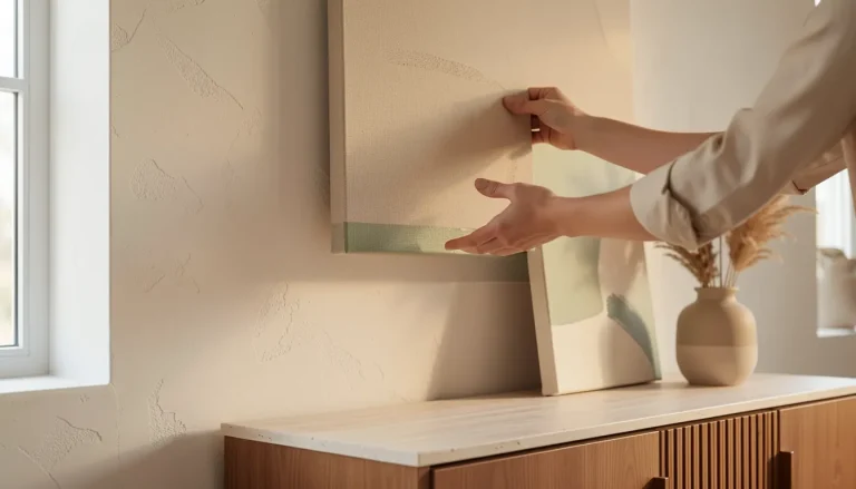
Measuring tape on wall marking artwork dimensions above sofa
Hanging too high
People instinctively hang art at standing eye level, but living rooms are for sitting. The center of the artwork should sit at 155 centimeters from the floor, not 170. If you’ve already hung it too high, lower the hooks. Use two hooks per piece, spaced 30 centimeters apart, to keep the frame level. For heavy frames (over 10 kilograms), use picture-hanging hooks rated for the weight, not nails or screws alone.
Choosing glossy glazing in bright rooms
Glass or glossy acrylic reflects windows and lights, turning the artwork into a mirror. Matte acrylic or non-reflective museum glass costs more but preserves visibility. If budget forces standard glass, angle the top of the frame forward 2 centimeters using adhesive felt pads on the bottom corners. This tilts reflections toward the floor instead of the viewer’s eyes.
Ignoring the float gap alignment
Float frames require the artwork to be perfectly centered in the frame opening. A 2 millimeter offset is visible from three meters away. When ordering, confirm the manufacturer centers the print mechanically, not by eye. On delivery, measure each gap with a ruler. If uneven, request a replacement. Do not accept ‘hand-finished variation’ as an excuse for misalignment on a premium reproduction.
Frequently asked questions
What size reproduction should I buy for above my sofa?
Choose a width between 60 and 75 percent of your sofa’s width. For a standard 240 cm sofa, that means 145 to 180 cm wide including the frame. The center of the artwork should sit at 155 cm from the floor for comfortable seated viewing.
Which frame style works best for famous paintings in a modern home?
Thin float frames in black, white, natural oak, or brushed metal suit modern interiors. They create a subtle shadow gap that makes the artwork appear to float. Avoid ornate gold or heavy wooden frames unless your decor is intentionally eclectic.
Can I mix different famous artworks in the same room?
Yes, but limit it to two or three pieces and unify them through frame style, color palette, or theme. For example, pair Vermeer’s portrait with a minimalist abstract in matching ochre and blue tones, both in natural oak float frames.
How do I prevent fading on art reproductions?
Avoid direct sunlight. Use UV-protective acrylic glazing or museum glass. Choose pigment-based giclée prints on archival canvas or fine art paper rated for 100+ years. Rotate artworks seasonally if a wall gets strong light part of the year.
What is a float frame and why use one?
A float frame has a gap between the artwork edge and the frame inner wall, creating a shadow line that separates the art from the frame. It adds depth, protects the artwork edges, and suits modern aesthetics better than traditional rabbet frames that cover the image border.
Five masterpieces. Five distinct personalities. Each earns its place on a modern wall not through reputation but through visual logic, color, geometry, scale. The Starry Night moves. The Kiss glows. The Girl watches. The Wave crashes. The Composition structures. Pick the one that solves your room’s specific need: movement, warmth, intimacy, drama, or order. Measure twice. Order once. Hang at seated eye level. The art does the rest.
Key takeaways
Starry Night adds cool energy to warm neutrals; hang at 155 cm center height with a thin black float frame.
The Kiss brings gold warmth; use a square format 80 to 100 cm wide with a warm gold or black float frame.
Girl with a Pearl Earring works at intimate scale (60×50 cm); light the pearl highlight with a 15-degree spot at 3000K.
The Great Wave scales horizontally to 150 cm wide; choose matte fine art paper on aluminum for crisp lines.
Composition VIII echoes mid-century geometry; extract red, yellow, blue as tiny accents only in a neutral room.
Partager sur :
Laure D
Passionate about interior design and architecture, Laure D. is the inspiring voice behind Museno. As a decor trends specialist, she elegantly decodes color harmonies, the art of detail, and space planning to transform every interior into a unique sanctuary. Through her articles and guides, Laure shares expert advice and inspiration to help you elevate your daily life, from contemporary minimalism to bolder aesthetics. Her mission: to bring life to your rooms and walls with inspiring, accessible ideas.