-35% SUR TOUS NOS TABLEAUXLIVRAISON OFFERTE DÈS 59€FABRIQUÉ EN EUROPE-35% SUR TOUS NOS TABLEAUXLIVRAISON OFFERTE DÈS 59€FABRIQUÉ EN EUROPE-35% SUR TOUS NOS TABLEAUXLIVRAISON OFFERTE DÈS 59€FABRIQUÉ EN EUROPE-35% SUR TOUS NOS TABLEAUXLIVRAISON OFFERTE DÈS 59€FABRIQUÉ EN EUROPE-35% SUR TOUS NOS TABLEAUXLIVRAISON OFFERTE DÈS 59€FABRIQUÉ EN EUROPE-35% SUR TOUS NOS TABLEAUXLIVRAISON OFFERTE DÈS 59€FABRIQUÉ EN EUROPE
35% OFF ALL OUR PAINTINGSFREE DELIVERY OVER £59MADE IN EUROPE35% OFF ALL OUR PAINTINGSFREE DELIVERY OVER £59MADE IN EUROPE35% OFF ALL OUR PAINTINGSFREE DELIVERY OVER £59MADE IN EUROPE35% OFF ALL OUR PAINTINGSFREE DELIVERY OVER £59MADE IN EUROPE35% OFF ALL OUR PAINTINGSFREE DELIVERY OVER £59MADE IN EUROPE35% OFF ALL OUR PAINTINGSFREE DELIVERY OVER £59MADE IN EUROPE
35% DE DESCUENTO EN TODOS NUESTROS CUADROSENVÍO GRATIS A PARTIR DE 59€FABRICADO EN EUROPA35% DE DESCUENTO EN TODOS NUESTROS CUADROSENVÍO GRATIS A PARTIR DE 59€FABRICADO EN EUROPA35% DE DESCUENTO EN TODOS NUESTROS CUADROSENVÍO GRATIS A PARTIR DE 59€FABRICADO EN EUROPA35% DE DESCUENTO EN TODOS NUESTROS CUADROSENVÍO GRATIS A PARTIR DE 59€FABRICADO EN EUROPA35% DE DESCUENTO EN TODOS NUESTROS CUADROSENVÍO GRATIS A PARTIR DE 59€FABRICADO EN EUROPA35% DE DESCUENTO EN TODOS NUESTROS CUADROSENVÍO GRATIS A PARTIR DE 59€FABRICADO EN EUROPA
35% DI SCONTO SU TUTTI I NOSTRI QUADRISPEDIZIONE GRATUITA SOPRA I 59€PRODOTTO IN EUROPA35% DI SCONTO SU TUTTI I NOSTRI QUADRISPEDIZIONE GRATUITA SOPRA I 59€PRODOTTO IN EUROPA35% DI SCONTO SU TUTTI I NOSTRI QUADRISPEDIZIONE GRATUITA SOPRA I 59€PRODOTTO IN EUROPA35% DI SCONTO SU TUTTI I NOSTRI QUADRISPEDIZIONE GRATUITA SOPRA I 59€PRODOTTO IN EUROPA35% DI SCONTO SU TUTTI I NOSTRI QUADRISPEDIZIONE GRATUITA SOPRA I 59€PRODOTTO IN EUROPA35% DI SCONTO SU TUTTI I NOSTRI QUADRISPEDIZIONE GRATUITA SOPRA I 59€PRODOTTO IN EUROPA
35% RABATT AUF ALLE UNSERE BILDERKOSTENLOSER VERSAND AB 59€HERGESTELLT IN EUROPA35% RABATT AUF ALLE UNSERE BILDERKOSTENLOSER VERSAND AB 59€HERGESTELLT IN EUROPA35% RABATT AUF ALLE UNSERE BILDERKOSTENLOSER VERSAND AB 59€HERGESTELLT IN EUROPA35% RABATT AUF ALLE UNSERE BILDERKOSTENLOSER VERSAND AB 59€HERGESTELLT IN EUROPA35% RABATT AUF ALLE UNSERE BILDERKOSTENLOSER VERSAND AB 59€HERGESTELLT IN EUROPA35% RABATT AUF ALLE UNSERE BILDERKOSTENLOSER VERSAND AB 59€HERGESTELLT IN EUROPA
35% KORTING OP AL ONZE SCHILDERIJENGRATIS VERZENDING VANAF 59€GEMAAKT IN EUROPA35% KORTING OP AL ONZE SCHILDERIJENGRATIS VERZENDING VANAF 59€GEMAAKT IN EUROPA35% KORTING OP AL ONZE SCHILDERIJENGRATIS VERZENDING VANAF 59€GEMAAKT IN EUROPA35% KORTING OP AL ONZE SCHILDERIJENGRATIS VERZENDING VANAF 59€GEMAAKT IN EUROPA35% KORTING OP AL ONZE SCHILDERIJENGRATIS VERZENDING VANAF 59€GEMAAKT IN EUROPA35% KORTING OP AL ONZE SCHILDERIJENGRATIS VERZENDING VANAF 59€GEMAAKT IN EUROPA
-35% SUR TOUS NOS TABLEAUXLIVRAISON OFFERTE DÈS 59€FABRIQUÉ EN EUROPE-35% SUR TOUS NOS TABLEAUXLIVRAISON OFFERTE DÈS 59€FABRIQUÉ EN EUROPE-35% SUR TOUS NOS TABLEAUXLIVRAISON OFFERTE DÈS 59€FABRIQUÉ EN EUROPE-35% SUR TOUS NOS TABLEAUXLIVRAISON OFFERTE DÈS 59€FABRIQUÉ EN EUROPE-35% SUR TOUS NOS TABLEAUXLIVRAISON OFFERTE DÈS 59€FABRIQUÉ EN EUROPE-35% SUR TOUS NOS TABLEAUXLIVRAISON OFFERTE DÈS 59€FABRIQUÉ EN EUROPE
35% OFF ALL OUR PAINTINGSFREE DELIVERY OVER £59MADE IN EUROPE35% OFF ALL OUR PAINTINGSFREE DELIVERY OVER £59MADE IN EUROPE35% OFF ALL OUR PAINTINGSFREE DELIVERY OVER £59MADE IN EUROPE35% OFF ALL OUR PAINTINGSFREE DELIVERY OVER £59MADE IN EUROPE35% OFF ALL OUR PAINTINGSFREE DELIVERY OVER £59MADE IN EUROPE35% OFF ALL OUR PAINTINGSFREE DELIVERY OVER £59MADE IN EUROPE
35% DE DESCUENTO EN TODOS NUESTROS CUADROSENVÍO GRATIS A PARTIR DE 59€FABRICADO EN EUROPA35% DE DESCUENTO EN TODOS NUESTROS CUADROSENVÍO GRATIS A PARTIR DE 59€FABRICADO EN EUROPA35% DE DESCUENTO EN TODOS NUESTROS CUADROSENVÍO GRATIS A PARTIR DE 59€FABRICADO EN EUROPA35% DE DESCUENTO EN TODOS NUESTROS CUADROSENVÍO GRATIS A PARTIR DE 59€FABRICADO EN EUROPA35% DE DESCUENTO EN TODOS NUESTROS CUADROSENVÍO GRATIS A PARTIR DE 59€FABRICADO EN EUROPA35% DE DESCUENTO EN TODOS NUESTROS CUADROSENVÍO GRATIS A PARTIR DE 59€FABRICADO EN EUROPA
35% DI SCONTO SU TUTTI I NOSTRI QUADRISPEDIZIONE GRATUITA SOPRA I 59€PRODOTTO IN EUROPA35% DI SCONTO SU TUTTI I NOSTRI QUADRISPEDIZIONE GRATUITA SOPRA I 59€PRODOTTO IN EUROPA35% DI SCONTO SU TUTTI I NOSTRI QUADRISPEDIZIONE GRATUITA SOPRA I 59€PRODOTTO IN EUROPA35% DI SCONTO SU TUTTI I NOSTRI QUADRISPEDIZIONE GRATUITA SOPRA I 59€PRODOTTO IN EUROPA35% DI SCONTO SU TUTTI I NOSTRI QUADRISPEDIZIONE GRATUITA SOPRA I 59€PRODOTTO IN EUROPA35% DI SCONTO SU TUTTI I NOSTRI QUADRISPEDIZIONE GRATUITA SOPRA I 59€PRODOTTO IN EUROPA
35% RABATT AUF ALLE UNSERE BILDERKOSTENLOSER VERSAND AB 59€HERGESTELLT IN EUROPA35% RABATT AUF ALLE UNSERE BILDERKOSTENLOSER VERSAND AB 59€HERGESTELLT IN EUROPA35% RABATT AUF ALLE UNSERE BILDERKOSTENLOSER VERSAND AB 59€HERGESTELLT IN EUROPA35% RABATT AUF ALLE UNSERE BILDERKOSTENLOSER VERSAND AB 59€HERGESTELLT IN EUROPA35% RABATT AUF ALLE UNSERE BILDERKOSTENLOSER VERSAND AB 59€HERGESTELLT IN EUROPA35% RABATT AUF ALLE UNSERE BILDERKOSTENLOSER VERSAND AB 59€HERGESTELLT IN EUROPA
35% KORTING OP AL ONZE SCHILDERIJENGRATIS VERZENDING VANAF 59€GEMAAKT IN EUROPA35% KORTING OP AL ONZE SCHILDERIJENGRATIS VERZENDING VANAF 59€GEMAAKT IN EUROPA35% KORTING OP AL ONZE SCHILDERIJENGRATIS VERZENDING VANAF 59€GEMAAKT IN EUROPA35% KORTING OP AL ONZE SCHILDERIJENGRATIS VERZENDING VANAF 59€GEMAAKT IN EUROPA35% KORTING OP AL ONZE SCHILDERIJENGRATIS VERZENDING VANAF 59€GEMAAKT IN EUROPA35% KORTING OP AL ONZE SCHILDERIJENGRATIS VERZENDING VANAF 59€GEMAAKT IN EUROPA
9 Common Art Placement Mistakes That Ruin Your Home’s Vibe
2 October 2026 Laure D 9 min de lecture
Art placement changes how a room feels the moment you walk in. A piece hung too high floats away from the furniture. A cluster spaced unevenly looks accidental. The wrong light turns rich pigments dull. These errors are common because the rules are rarely explained in plain terms. This guide covers nine mistakes that flatten a room’s atmosphere and the practical fixes that bring balance back.
The most common art placement mistakes include hanging pieces too high, ignoring furniture scale, using poor lighting, and choosing wrong hardware. Center artwork at 57-60 inches from the floor, match art width to two-thirds of furniture width, and use picture lights with high CRI bulbs to show true colors.
Hanging Art Too High
The single most frequent error is placing the center of the artwork above eye level. When the focal point sits too high, the viewer strains their neck and the piece disconnects from the seating area below. The standard used by galleries and designers places the vertical center of the art between 57 and 60 inches from the floor. This aligns with average human sightlines and creates a natural visual anchor.
The 57-Inch Center Rule
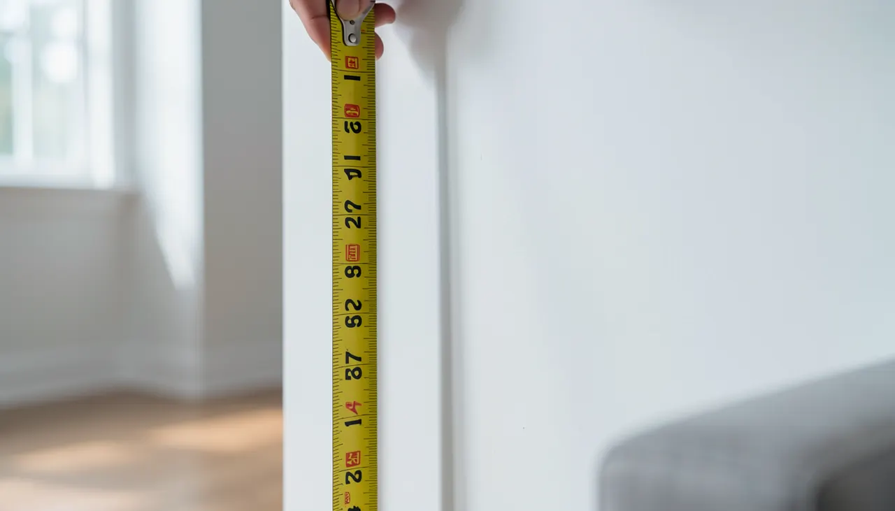
Measure 57 inches up from the floor and mark that point on the wall. That mark represents the center of your artwork, not the top of the frame. From there, calculate the hook position by measuring the distance from the top of the frame to the hanging wire or D-ring when pulled taut. Subtract that distance from your center mark to place the hook. This method works for single pieces and the central piece of a gallery wall.
Adjusting for Seating Height
In rooms where people mostly sit, dining rooms, home offices, living rooms, lower the center point to 54 or 55 inches. Seated eye level drops roughly three to four inches compared to standing. A dining room piece centered at 57 inches will feel lofty to someone at the table. Test by sitting in the primary chair and checking if the art’s middle meets your gaze comfortably.
Measuring tape showing 57 inches on wall
Ignoring Furniture Scale and Proportion
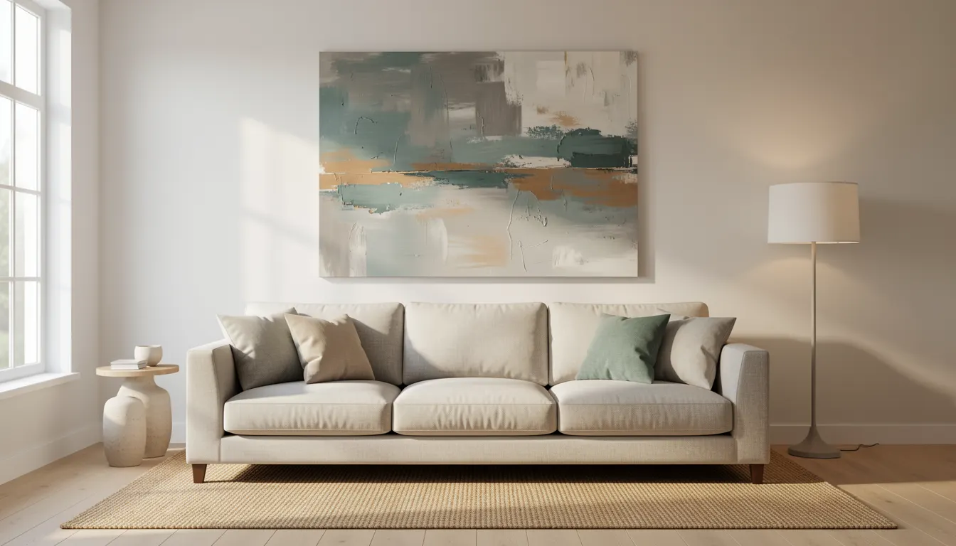
A tiny print above a wide sectional looks lost. An oversized canvas over a narrow console feels top-heavy. The artwork width should relate to the furniture width beneath it. A reliable guideline: the art or grouping should span roughly two-thirds the width of the furniture piece. This creates visual harmony without crowding the edges.
Two-Thirds Width Guideline
Measure the width of the sofa, bed, credenza, or table. Multiply by 0.66. That number is your target total art width. A 90-inch sofa calls for about 60 inches of art, either one large piece or a grouped arrangement. If using multiple frames, keep the outer edges within that span. Leave 6 to 12 inches of wall space on each side so the composition breathes.
Vertical vs Horizontal Orientation
Match orientation to the wall shape. A tall narrow wall between windows suits a vertical piece or a stacked pair. A long horizontal wall over a low credenza wants a landscape format or a horizontal triptych. Forcing a vertical piece on a wide wall leaves awkward empty strips on the sides. Forcing a horizontal piece on a narrow wall crowds the ceiling and baseboard.
Sofa with correctly sized artwork above
Poor Lighting Choices
Lighting reveals or ruins artwork. Direct sunlight fades pigments and damages paper within months. Overhead recessed cans create glare on glass and varnish. Dim corners hide detail. The goal is even illumination with a high color rendering index (CRI) so colors read true, and no UV emission to protect the piece.
Avoid Direct Sunlight
Never hang original works, prints on paper, or textiles where direct sun hits them for more than 30 minutes a day. UV rays break down organic dyes and yellow varnish. If the wall gets strong light, use UV-filtering window film or choose UV-protective glazing on the frame. Rotate pieces seasonally if relocation isn’t possible.
Choosing the Right Bulb
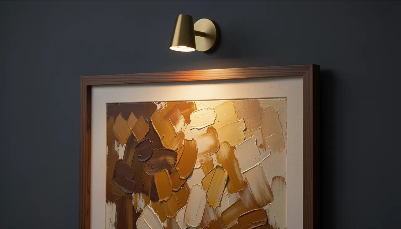
LED picture lights or track heads with 90+ CRI and 2700K–3000K color temperature mimic warm daylight without heat. Mount picture lights 6 to 8 inches above the frame top, angled down at 30 degrees. For track lighting, position fixtures 24 to 36 inches from the wall. Avoid cool white (4000K+) bulbs, they make warm paintings look gray and skin tones flat.
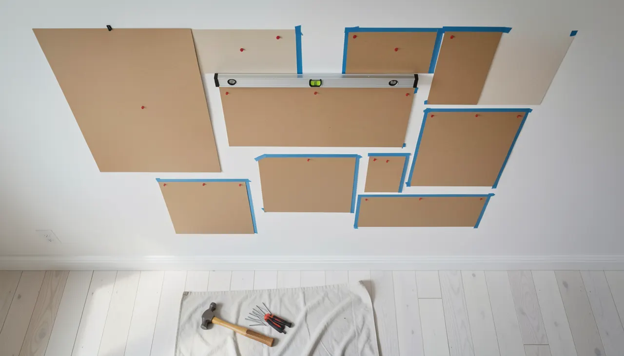
A gallery wall adds personality but collapses into visual noise when frames are spaced randomly or styles clash without intent. The fix is a layout plan on the floor or paper templates on the wall before a single nail goes in. Consistent spacing, usually 2 to 3 inches between frames, turns a collection into a cohesive composition.
Paper Template Method
Trace each frame onto kraft paper or newspaper. Cut out the shapes. Mark the hanging point on each template. Arrange on the wall with painter’s tape. Step back. Adjust until the grouping feels balanced. This lets you test spacing, alignment, and overall shape without holes. Once satisfied, nail through the marked points, tear away paper, and hang.
Consistent Spacing Rules
Keep gaps uniform. Two inches works for small frames (8×10 inches and under). Three inches suits larger pieces. Align outer edges to an invisible grid, either top edges level, bottom edges level, or centers on a shared horizontal line. Mix frame styles freely if the color palette stays tight (all black, all gold, all natural wood). Mixed colors need tighter style consistency.
Paper templates taped to wall for gallery layout
Wrong Hardware for Weight and Wall Type
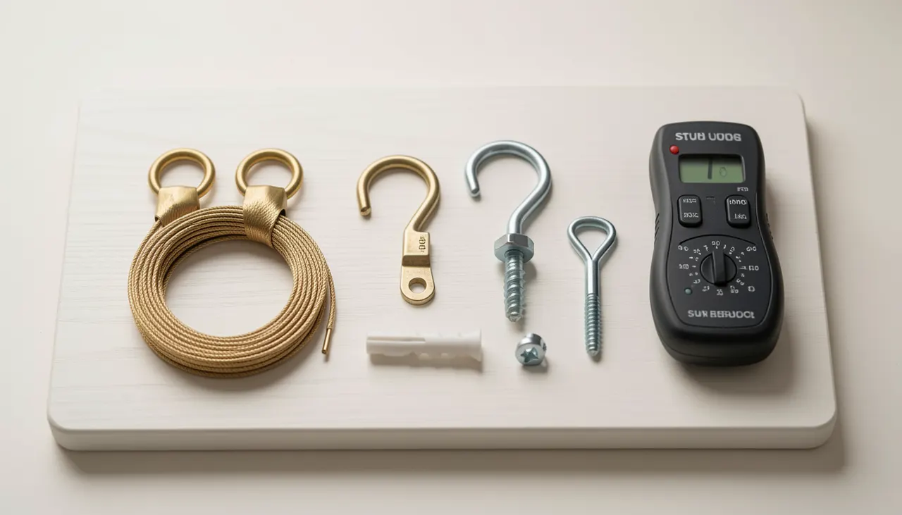
A heavy mirror on drywall anchors rated for 20 pounds will pull out. A light canvas on a massive lag bolt leaves an ugly hole. Match hardware to three factors: artwork weight, wall material (drywall, plaster, brick, concrete), and whether you hit a stud. Using the right fastener prevents damage and keeps art level for years.
Drywall Anchors vs Studs
For pieces under 15 pounds on drywall, a self-drilling plastic anchor or a metal toggle bolt works. For 15 to 50 pounds, use a snap toggle or molly bolt rated for the load. Over 50 pounds, you must hit a stud, use a wood screw at least 2 inches long into the stud center. A stud finder costs $15 and saves repair time. Plaster walls need longer anchors that bite into the lath behind.
Wire vs D-Rings
Wire allows slight level adjustment but creates a forward tilt on heavy pieces. Two D-rings mounted level on the frame back keep the piece flat against the wall and distribute weight evenly. For anything over 20 pounds, D-rings are stronger and safer. Use picture hooks rated for the weight, standard hooks hold 10 to 20 pounds, heavy-duty hooks hold 50 to 100 pounds.
Assorted picture hanging hardware on wood surface
Neglecting Room Function and Traffic Flow
Art in a hallway gets bumped. Art above a fireplace competes with heat and soot. Art in a bedroom should calm, not energize. Placement must respect how the room is used. High-traffic zones need secure mounts and shatter-resistant glazing. Quiet zones benefit from larger, slower-reading pieces.
High-Traffic Areas Need Secure Mounts
Hallways, stairwells, and entryways see shoulders, bags, and elbows. Use security hangers (two-point cleats or locking brackets) that prevent lift-off. Choose acrylic glazing instead of glass for pieces below 60 inches from the floor. Keep frames at least 4 inches clear of door swing paths. In kids’ rooms, mount well above reach or use museum putty on bottom corners.
Calming Art for Bedrooms
The first and last thing you see sets the tone. Avoid high-contrast abstracts or busy figurative work directly opposite the bed. Choose muted palettes, horizontal landscapes, or minimal compositions. Hang the center at seated eye level on the bed, roughly 48 to 52 inches from the floor. This lowers the visual weight and encourages relaxation.
Calm bedroom with horizontal landscape art above bed
Matching Art Too Literally to Decor Colors
Picking art that exactly matches the sofa, rug, or throw pillows makes the room feel flat and showroom-like. Art should converse with the palette, not mimic it. Contrast, a cool painting in a warm room, a saturated accent in a neutral space, creates depth. The art becomes a focal point rather than camouflage.
Contrast Creates Interest
In a room dominated by beige, cream, and warm wood, a piece with deep indigo, burnt umber, or charcoal anchors the scheme. In a cool gray and white room, a work with ochre, terracotta, or olive green adds warmth. The contrast color should appear elsewhere in small doses, a vase, a book spine, a pillow edge, to bridge the gap.
Using a Color Bridge
If you want harmony without matching, pull one minor hue from the art into a textile or accessory. A painting with a thin rust line in a mostly blue composition pairs with a rust throw blanket. The eye travels from art to object and back, linking them without monotony. This works better than hunting for a painting that duplicates the dominant sofa color.
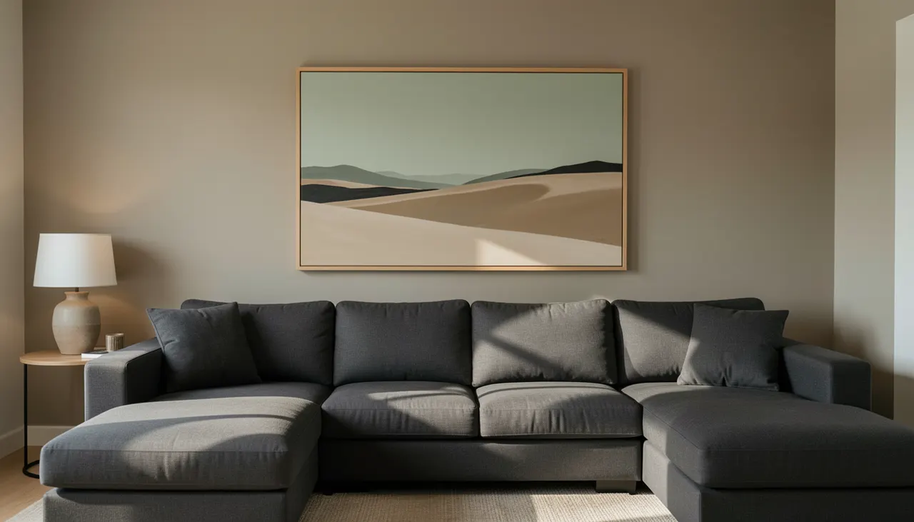
Living room with contrasting art colors
Frequently asked questions
What is the correct height to hang a picture?
The center of the artwork should sit 57 to 60 inches from the floor for standing view. In seating areas like dining rooms or living rooms, lower the center to 54 or 55 inches to match seated eye level.
How far apart should frames be in a gallery wall?
Keep spacing consistent at 2 inches for small frames (up to 8×10 inches) and 3 inches for larger frames. Align outer edges to a shared grid line, top, bottom, or center, for a cohesive look.
Can I hang heavy art on drywall without a stud?
Only up to about 50 pounds using rated toggle bolts or snap toggles. For anything heavier, you must anchor into a wall stud with a wood screw at least 2 inches long.
Should artwork match my sofa color?
Exact matching flattens the room. Choose art that contrasts or pulls a minor accent color from the space. Bridge the difference with a small accessory in that accent hue.
What type of light bulb is best for artwork?
Use LED bulbs with a CRI of 90 or higher and a color temperature of 2700K to 3000K. Avoid cool white bulbs (4000K+) and direct sunlight, which fades pigments.
Good placement turns decoration into design. The rules are simple: center at eye level, scale to furniture, light for color truth, plan before nailing, and let art contrast the room. Apply these nine fixes and every piece you hang will hold its place with intention.
Key takeaways
Hang art with its center 57 to 60 inches from the floor for standing areas.
Size artwork to two-thirds the width of the furniture below it.
Use 90+ CRI LED lights at 2700K–3000K; avoid direct sun on art.
Plan gallery walls with paper templates and keep gaps at 2–3 inches.
Match hanging hardware to weight, wall type, and stud location.
Partager sur :
Laure D
Passionate about interior design and architecture, Laure D. is the inspiring voice behind Museno. As a decor trends specialist, she elegantly decodes color harmonies, the art of detail, and space planning to transform every interior into a unique sanctuary. Through her articles and guides, Laure shares expert advice and inspiration to help you elevate your daily life, from contemporary minimalism to bolder aesthetics. Her mission: to bring life to your rooms and walls with inspiring, accessible ideas.